Visualisation of data and map in Power BI

I have tested the ability of Power BI to display data on maps. I have quickly it a roadblock as Power BI geolocation accuracy was fairly average in my experience. I managed to overcome some of the issue with Google Maps API and Python. See how.

Fuel Station location data and Power BI

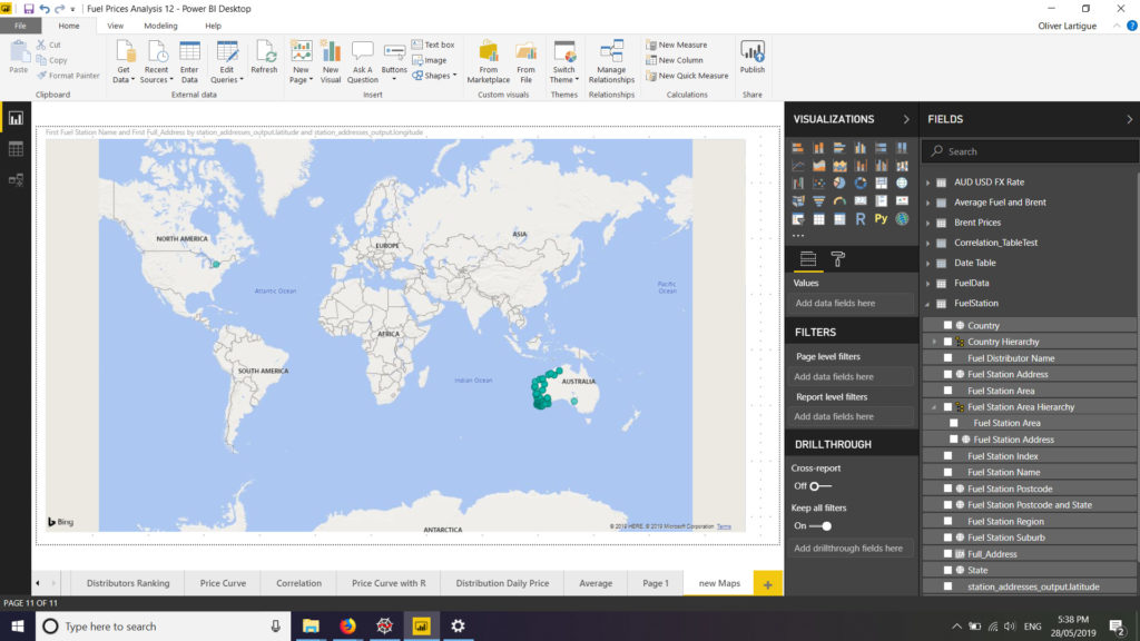
Firstly I wanted to visualise the data in maps. I tried to plot the fuel station on a map but the result was disappointing. On the visual only a few station were plotted in WA (Western Australia) whereas all stations are actually located in WA. This is despite me having all the relevant data for the addresses (but the GPS coordinates), namely street number and name, suburb, postal code, state and country. I tried using different fields and hierarchy on the visuals… alas most of my WA fuel stations continued to be plotted all over the world, especially in the USA. See below:

After a bit of digging it seems that Bing used by Power BI for its maps visual is not particularly accurate. Google Maps on the contrary receives much more praised for its accuracy but is not available on Power BI. A workaround is to get GPS coordinates from Google Maps and uses then the longitude and latitude in Power BI to get accurate map visualisation. However there are nearly 700 fuel stations in WA, so it required a bit of automation. To get GPS coordinates from Google Maps API I used a Python. My script is largely derived from the one you can find on https://www.shanelynn.ie/batch-geocoding-in-python-with-google-geocoding-api/

After retrieving the GPS coordinates from Google Maps API the result was much improved.

Only 2 GPS coordinates were obviously wrong (one pointed to the USA and the other to South Australia) and 5 GPS coordinates were not found by the API. I added manually the 7 missing or incorrect coordinates and moved on.

Leave a Reply