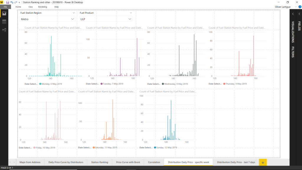
It is interesting to note that:
– on Monday, the day of the week to fill your tank with cheap gas, most fuel station offers an attractive price although there is a significant number of petrol station which practices high prices.
– On Sunday, the fuel price distribution is nearly normal, meaning that there a quite a good number of deal around but you will have to be selective.
– on all other days, the distribution is materially skewed to the left meaning high prices in most petrol station. The chart shows that there is a smaller peak in the middle meaning that a non-insignificant number of fuel station offer more decent prices (although still higher than on Monday).
– On any given days it is possible to find a petrol station with a price that is comparable to the best price you can get on Monday.
As a caveat the distribution are for a particular week only, so it would be interesting to confirm these observations hold for any week. It requires a bit of normalisation of the data beforehand and I will come to that later on.